
My Approach
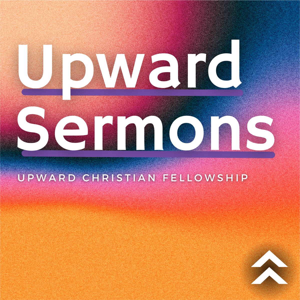
In the fall of 2016, I was approached by Nate Hill, then associate pastor at UCF, to help rebrand the church with a more modern logo. They gave me free rein but requested that I take two things into consideration. First, the church was debating whether to keep its current name or rebrand as “Upward Church.” Second, they also wanted to retain the existing mountain motif in the new logo. With these goals in mind, I set out to create a logo that reflected their evolving identity while paying homage to the original logo.
The Process
Considering the church's desire for a modern look, I quickly settled on a clean, sans-serif typeface for its modern and approachable feel. The logo, however, required more exploration. With input from the client, I initially sketched designs featuring the mountain ranges behind the church, but this direction was ultimately set aside. After exploring various design options, we landed on a logo that uses stacked chevrons. These chevrons serve a dual purpose: they subtly evoke mountain peaks while also pointing “upward,” echoing the church’s name and vision.